
phcurado
DaisyUIComponents - A Phoenix LiveView + DaisyUI library 🌼
DaisyUIComponents is a library that seamlessly integrates the amazing DaisyUI component library into your Phoenix LiveView project.
It replaces Phoenix’s default CoreComponents with pre-styled DaisyUI components, making it easier to switch your application’s UI.
It also provides 30+ DaisyUI components built in using the Phoenix component engine.
Storybook: Phoenix + DaisyUI - Welcome
Links
Most Liked
phcurado
New version released 
Now the welcome page have a theme switch and new components were added

Hero
The ideal component for your landing page

Join
Join any component with the join component and utility classes

<.join direction="horizontal">
  <.button class="join-item">Button</.button>
  <.button class="join-item">Button</.button>
  <.button class="join-item">Button</.button>
</.join>
Indicator
Component to place content on the corner of another element

<.indicator >
  <:badge color="success">hi</:badge>
  <div class="bg-base-300 grid h-32 w-32 place-items-center">content</div>
</.indicator>
More components will be added soon, with plans to ensure compatibility with the upcoming DaisyUI 5.0, which is set to launch in two weeks 

LostKobrakai
Daily UI will become part of the next phoenix release, the change has been merged, but annoucements will likely only be had once the release is ready.
phcurado
DaisyUI Components Version 0.8 Released
This new version is now compatible with the new DaisyUI V5, thank you @typesend for starting this work on the repo.
The new UI can be seen on the storybook.
On top of that, new components were added, here is a quick display of them:
Label
The label component was introduced in the new DaisyUI version, we can add labels to inputs:

Code example:
<.label text="https://" type="input">
  <input type="text" placeholder="URL" />
</.label>
We can have labels before or after the input. We also have floating labels, take a look on the Label Storybook for all options
Fieldset
Probably the most important component of this release. The fieldset is useful to group several controls and is now used on all form inputs to group label, input and errors in a form.
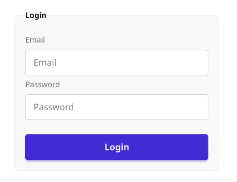
Code example:
<.fieldset class="w-xs bg-base-200 border border-base-300 p-4 rounded-box">
  <.fieldset_legend>Login</.fieldset_legend>
  <.fieldset_label>Email</.fieldset_label>
  <.input type="email" placeholder="Email" />
  <.fieldset_label>Password</.fieldset_label>
  <.input type="password" placeholder="Password" />
  <.button class="btn btn-primary mt-4">Login</.button>
</.fieldset>
Progress
Maybe not the most popular component but it’s a nice one to have, it’s really easy to add it on your site:
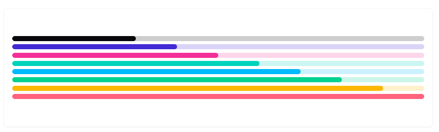
Code example:
<.progress color="primary" max={100} value={40}/>
Footer
And the last component of this release, the footer component.

Footer Storybook
Roadmap
- Compatibility with DaisyUI V5 - Done

- Implement more components and storybooks, the missing components can be seen on the Readme component’s section
- Support for tailwind 4.0
- Monitor the new phoenix release to avoid compatibility issues when it’s released a new version
- Create
mixscript to enable users to import the components of this library into their projects, sharing the same project namespace.
Thanks everyone 

olivermt
Is there any plans to add more reactivity on top of the existing daisy components? It is a glaring hole atm in Daisy that almost nothing is mobile first (try looking at the tables from a phone), but this seems very achievable to patch over in the library. Adding things like attrs for the col slots for how it collapses in lower media queries etc.

antfarm
Meanwhile, here is the commit and the github issue:
Popular in Libraries









Other popular topics



 Latest Phoenix Threads
Latest on Elixir Forum
Sponsor Spotlight

Catch errors, track performance, monitor hosts and more.
Categories:
Sub Categories:
Forums
Our Sponsors

Build Elixir applications with speed and confidence.

Supporting innovation across the BEAM ecosystem.

We build reliable cloud platforms for business-critical systems.
Catch errors, track performance, monitor hosts and more.

Practical resources that improve the lives of professional developers.

Producing high quality Elixir screencasts since 2017.

The deployment platform built for Elixir: PaaS ease, VPS control.

Courses that'll move you from confusion to "Aha, now I get it!"