
Antrater
Moon Design System - Set of UI components built with Surface UI library
Hi everyone!
I’m thrilled to announce a huge thing. We have been developing Elixir Moon Design System for quite a while. We are finally ready to Open Source Moon DS written in Elixir language today.
Isn’t it outstanding?! We are presenting the Design System to the Elixir world. Our goal is to make Elixir Moon DS stunning and mature.
The main idea behind Moon Design System is to provide an easy-to-use tool for building beautiful front-ends fast. We have dedicated designers and developers in our team. Despite that, we are welcoming you guys to participate. If you’ve found a bug, or have an idea about how to improve our product and simplify your life as a developer, don’t hesitate to ping us either on Github or here.
Truly yours,
Moon Design System team
Most Liked

dmitriid
If a design system requires an investment in a new monitor, that design system failed.
Things like dark gray text on a marginally lighter gray background objectively have poor readability. 1 pixel wide very light gray borders are objectively poorly distinguishable on white backgrounds. Etc.
Designers should do well by reading guidelines from people who have thought about these issues long and hard. E.g., gov.uk design system: Government Design Principles - GOV.UK and Accessibility strategy – GOV.UK Design System
- This is for everyone
Accessible design is good design. Everything we build should be as inclusive, legible and readable as possible. If we have to sacrifice elegance - so be it. We’re building for needs, not audiences. We’re designing for the whole country, not just the ones who are used to using the web. The people who most need our services are often the people who find them hardest to use. Let’s think about those people from the start.
So what immediately jumps at me (a person with a 4k Dell monitor and 20/20 vision) when looking at text fields in Moon:
Disabled fields:
- Foreground is black, but with 30% opacity
- Background is dark-ish gray

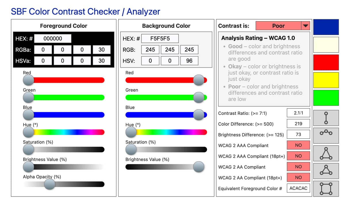
Disabled fields with removed background:


Borders on disabled text fields:
(see disabled field above for an example)
Note: it’s all opacity 30:

** Borders on regular text fields **
Barely okay



Edit: typo

josevalim
Hi @dmitriid. I am sure feedback is appreciated but I also believe we can be more constructive by having clearer and less rhetoric feedback. For example:
This is unreadable. The thin light gray border is also barely visible on white background.
This is a problem I commonly see in design systems, so it can be an opportunity to do it better. I would say sticking with browser defaults often work best.
We are all people here (at least for now :P) and I am sure no one is actively trying to make the user experience worse for others.
Thanks! <3

hauleth


stevensonmt
If you’re open to some criticism of the site (not the library, which I’m sure is great), I wonder if it’s a great endorsement for a UI/UX system.
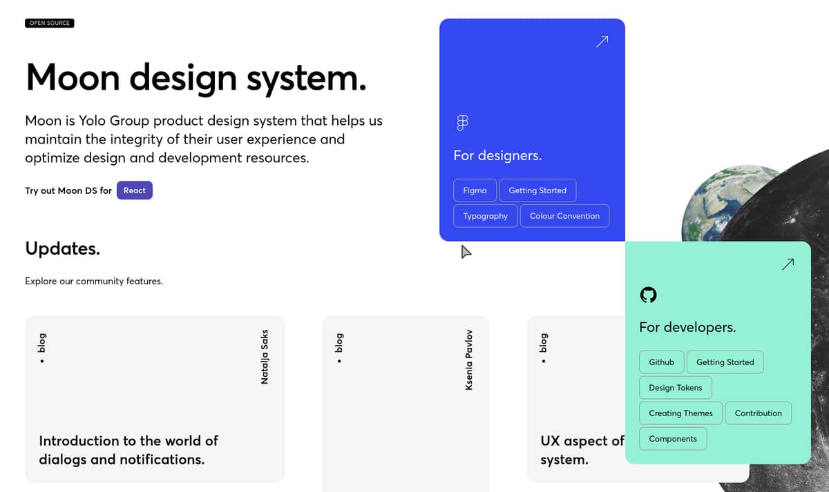
You’ve got a card literally covering up some text about UX that requires the user find the horizontal scrollbar to uncover. Those colored cards seem to just be taking up too much space for the information they offer and get in the way of other elements.
The intro text could use some English polish as well:
Moon is Yolo Group product design system that helps us maintain the integrity of their user experience and optimize design and development resources.
The above has a confusing pair of pronouns without antecedents. Who is “us” referring to? Who is the “they” that “their” is referring to? I would suggest something like
Moon is the Yolo Group product design system that helps developers maintain the integrity of their user experience while optimizing design and development resources.
Or perhaps
The Yolo Group presents our Moon Design System to help developers improve the quality and consistency of the user experience while optimizing design and development resources.
Antrater
Attention React developers!
We’re excited to announce a significant update to Moon Design System, our stunning and mature design system that’s now open source. Eight months ago, we announced the initial release, and since then, we’ve made countless changes and improvements to make it even better.
With atomic design principles and strict UX/UI rules in place, every pixel in every component of Moon DS is designed with intention. And with multibranding capabilities, you have the power to customize and make your product look and feel unique.
Our mission is simple: to provide an easy-to-use tool for building beautiful front-ends fast. Our dedicated designers and developers have worked tirelessly to make this a reality, but we need your help. If you find a bug or have an idea to improve our product, we encourage you to join us on GitHub or here and let us know.
We can’t wait to see what you create with Moon Design System!
Best regards,
the Moon Design System team
Popular in Libraries





Other popular topics




Latest on Elixir Forum
Sponsor Spotlight

Develop your skills with books, videos, and courses.
Categories:
Sub Categories:
Forums
Our Sponsors

Build Elixir applications with speed and confidence.

Supporting innovation across the BEAM ecosystem.

We build reliable cloud platforms for business-critical systems.

Catch errors, track performance, monitor hosts and more.
Develop your skills with books, videos, and courses.

Producing high quality Elixir screencasts since 2017.

The deployment platform built for Elixir: PaaS ease, VPS control.

Courses that'll move you from confusion to "Aha, now I get it!"